Photo by KOBU Agency on Unsplash
Many people have said that while we’ve all been in the same storm with COVID, we’ve been in our own boats. People have had very different experiences during the past year, based on their gender, race, geographic location and more.
Today Statistics Canada released a report about the social and economic impacts of COVID, which includes some disaggregated data. Some of the findings aren’t surprising:
- In Montreal and Toronto, mortality rates are higher in areas with greater concentrations of Black Canadians
- Indigenous groups are experiencing greater health impacts
I wish these findings were written with an equity lens. Systemic racism, colonization, poverty, income inequality, employment precarity, access to clean water and adequate housing are all connected to who was hit hardest by COVID. Naming these factors means that we need to own that our current systems and policies are not working for everyone. It means that we need to take responsibility for advocating for change.
I’m glad that we’re starting to see disaggregated data in Canada, so that we have data to better understand systemic inequality and so that we can make better policy to change this.
Still, I want so much more. I want to see data presented in an intersectional manner. I suspect COVID has hit women of colour hardest, especially Filipino, South Asian and Black women who work in health care. Without quantitative data it’s hard to do a systems level analysis to understand who is most impacted.
I want language that is in plain English. Initially I thought that “not indigenous or a visible minority” meant white people, but journalist Jessica Galang pointed me to this StatsCan page:
The “Not a visible minority” category includes persons who gave a mark-in response of “White” only; persons who gave mark-in responses of “White and Latin American”, “White and Arab” or “White and West Asian” only; persons who gave a mark-in response of Latin American, Arab, or West Asian only, along with a European write-in response; and persons with no mark-in response who gave a write-in response that is not classified as a visible minority. As indicated previously, this category also includes Aboriginal persons.
This definition is super confusing.
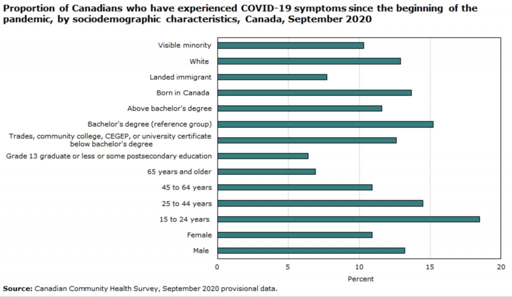
I want this data presented in an accessible way. This horizontal bar graph graphs race categories, citizenship categories, educational achievement categories, age group categories, and sex categories together. From a methodology perspective I find this very confusing. This graph doesn’t have alt text, so it excludes screenreader users. There’s a data table below this graph is accessible, but the graph isn’t. I don’t think this meets the standards in the Accessible Canada Act, which is especially disappointing from a federal government department.
I want to see more data along other dimensions of diversity, especially disability and sexuality. From listening to people around me, I know that COVID has impacted people with disabilities harder than people without disabilities. I wonder if queer and trans people have been impacted in a different way too? Without data we don’t really know, and more importantly we continue to develop policies that don’t account for systemic ableism and hetrerosexism.
Finally, I want to rethink the race categories in Canada to use language that is respectful and reflects the ways that communities talk about themselves. I’m a mixed race person. My mom in Japanese-Canadian and my dad is white, of Scottish and Irish ancestry. I’m a woman of colour. I hate the phrase visible minority as it centers whiteness and is colonial. I know this isn’t easy for so many reasons and it makes it harder to map historical trends.
If you care about how data can be used in ethical ways to highlight inequality and as a tool for systemic change, check out The BC Office of the Human Rights Commissioner’s report on Disaggregated demographic data collection in British Columbia: The grandmother perspective. The phrase “the grandmother perspective” came from Gwen Phillips of the Ktunaxa Nation, who is a BC First Nations Data Governance Initiative Champion. This phrase speaks to the importance of relationship. Disaggregated data is a tool to help us move towards equality and justice. She says, “we are not measuring race, we are measuring racism. Racism is a systems failure; that must be made clear when talking about race-based data.”

